Case Study: A Unit Signals on Its CUSUM and Sits Inside Its Funnel — Both Readings Are Right
A surgical unit passed its funnel plot comfortably and signalled three times on its CUSUM over the same 24 months. Neither chart is wrong — they answer different questions. Worked end to end in Inference Stats.
Outcome monitoring usually gets presented as though there were one question — is this unit an outlier? — and a choice of tools for answering it. That framing is what produces the two familiar arguments: a unit insisting the funnel plot cleared it, and a monitoring committee pointing at a CUSUM that has signalled three times.
They are not disagreeing about the answer. They are answering different questions, and on the data below both of them are right.
The data
5,417 cardiac procedures across eight units over 24 months, with 30-day mortality as the outcome, age and urgency of the operation as risk factors, and 220 deaths overall — a crude rate of 4.06%.
One unit was built to deteriorate. Unit H performs normally for sixteen months and then gets substantially worse. Everything below is what the two charts actually made of that, computed in Inference Stats rather than asserted here.
What the funnel plot said
The risk-adjusted funnel fits a logistic model on age and urgency, sums each unit's predicted risks to get its expected deaths, and plots observed ÷ expected against expected events.
| Unit | Observed | Expected | O/E | z |
|---|---|---|---|---|
| Unit A | 30 | 31.84 | 0.942 | −0.33 |
| Unit B | 31 | 29.56 | 1.049 | 0.26 |
| Unit C | 43 | 29.93 | 1.437 | 2.39 ⚠ |
| Unit D | 17 | 26.75 | 0.635 | −1.89 |
| Unit E | 32 | 35.60 | 0.899 | −0.60 |
| Unit F | 3 | 8.80 | 0.341 | −1.96 ⚠ |
| Unit G | 33 | 30.09 | 1.097 | 0.53 |
| Unit H | 31 | 27.42 | 1.130 | 0.68 |
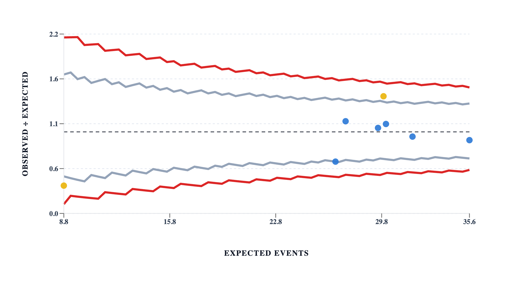
Unit C sits outside the 95% band. Unit H does not — it is not even close, at 0.68 standard errors above a ratio of 1. On this chart Unit H is an unremarkable unit having an unremarkable two years.
That reading is correct. Over 24 months, Unit H really did have about as many deaths as its casemix predicted.
What the CUSUM said
The same cases, the same risk model, in order. A risk-adjusted CUSUM accumulates a log-likelihood-ratio weight per case — up on a death, down on a survival, each sized by that patient's own predicted risk — and signals when the run of excess crosses a limit. Here: detect a doubling of the odds of death, limit 2.5, restart at half the limit after a signal.
| Unit | Signals | When |
|---|---|---|
| Unit A | 0 | — |
| Unit B | 1 | month 3 |
| Unit C | 2 | months 12, 21 |
| Unit D | 0 | — |
| Unit E | 2 | months 5, 7 |
| Unit F | 0 | — |
| Unit H | 3 | months 17, 21, 24 |
Unit H signals three times. Every one of them falls after month 16, and it signals not once in the sixteen months before.
Why both readings are right
Split Unit H's two years at the point the chart is pointing to:
| Unit H | Cases | Observed | Expected | O/E |
|---|---|---|---|---|
| Months 1–16 | 440 | 8 | 18.1 | 0.443 |
| Months 17–24 | 243 | 23 | 9.4 | 2.459 |
| Whole period | 683 | 31 | 27.4 | 1.130 |
For sixteen months Unit H had less than half the deaths its casemix predicted. Then it had nearly two and a half times as many. Averaged over 24 months those cancel almost exactly, which is why the funnel shows 1.13 and shrugs.
The funnel is not failing to detect the deterioration. It is answering the question it was asked — over this whole period, was this unit's aggregate different from its peers? — and the honest answer to that question is no. The excess of the last eight months is real, and it is also genuinely offset by the sixteen months before it.
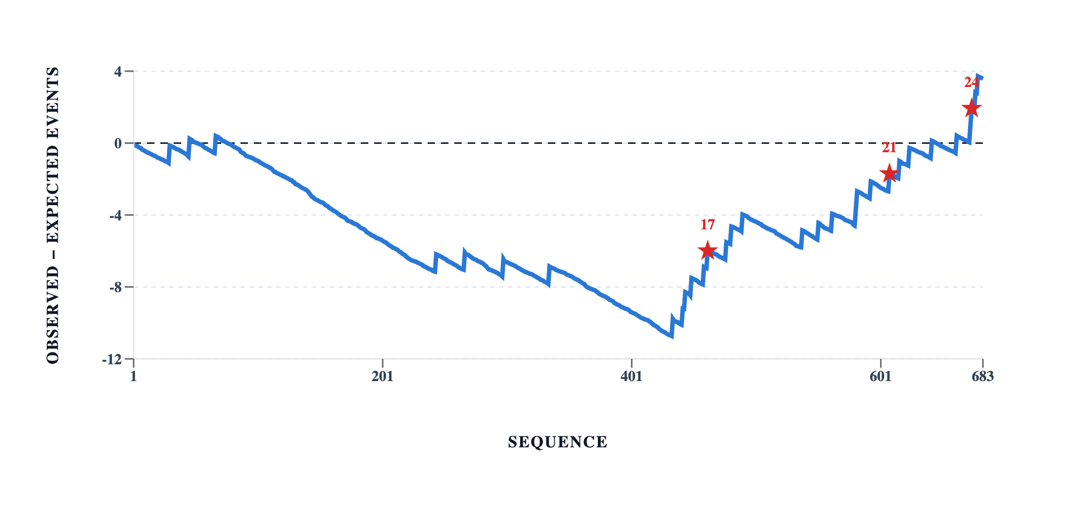
The shape is the argument. The line spends sixteen months going the right way — Unit H banking credit against its casemix, down to nearly eleven fewer deaths than predicted — and then reverses. The first star is struck while the line is still six deaths below zero.
The single number that carries the whole point: at Unit H's first signal, its cumulative observed − expected was −5.99. The unit was six deaths in credit against its casemix and in trouble right now, simultaneously. Both charts are reporting that correctly. Only one of them was asked a question whose answer changes anything.
Where the change happened
A signal says by here, something has gone wrong. It does not say where it started: a CUSUM crosses its threshold some distance after the shift that caused it, and how far depends on how big the shift was.
Running change point detection on Unit H's monthly observed − expected series, PELT with a BIC penalty places a single change after month 16, splitting the series into months 1–16 with a mean of −0.63 deaths per month and months 17–24 with a mean of +1.71.
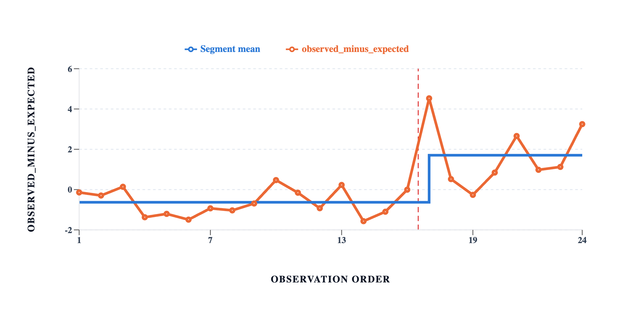
The deterioration was built into month 17, so the estimate is exactly right. It is worth being clear about how easy that was: the shift here was large — from O/E 0.44 to 2.46 — and the CUSUM crossed its limit 22 cases into month 17, so the signal and the change point agree to within a few weeks. A smaller shift takes longer to accumulate past the limit, the gap between the two widens, and the change point estimate becomes the one worth quoting. Using the signal date as the change date is a habit that costs nothing on data like this and sends a review to the wrong month on data that is less obliging.
Unit C is the mirror image
Unit C is the one the funnel flagged, at O/E 1.437. Run the same change point detection on its monthly series and it finds no change at all — one mean describes all 24 months.
That is the correct answer and it is the useful one. Unit C has not deteriorated. Unit C has been like this the whole time, which is a different problem with a different investigation attached: not "what happened in month 17?" but "what has this unit been doing since we started counting?"
Its early and late halves do differ numerically — O/E 1.278 then 1.773 — and the analysis declines to call that a change, because at this penalty the difference is not distinguishable from month-to-month noise. Splitting a series by eye and comparing the halves would have produced a confident finding out of nothing.
Unit F, and the cost of being small
Unit F has the best crude mortality in the group: 1.42% against a 4.06% average, and an O/E of 0.341. It carries a warning marker on the good side of the funnel.
It is also the smallest unit, with 212 cases and 8.8 expected deaths. Three more deaths over two years — one every eight months — would move it to O/E 0.68 and well inside the band. A unit topping a crude league table on that volume is not evidence of excellence; it is a small number with a wide interval around it, and the funnel's job is to show exactly that by being wide where the data are thin.
What we would report
- Unit H changed. The finding is a change in month 17, not a level. It is supported by a risk-adjusted CUSUM signalling three times after month 16 and never before, and localised by change point detection to the month 16/17 boundary.
- Unit C is a level, not a change — a persistent excess with no evidence of a change point anywhere in the series.
- Both charts, with their questions stated. The funnel answers whether a unit's aggregate differs from its peers; the CUSUM answers whether its sequence has departed from a target. Reporting one without saying which question it answered is how the argument at the top of this article starts.
- The CUSUM's parameters, because they change the answer: an odds ratio of 2 as the shift to detect, a limit of 2.5, restart at half the limit. A lower limit signals sooner and more often, and there is no setting that avoids that trade — only settings that place it somewhere.
What we would not report
Unit H as "within expected limits", full stop. It is, on the funnel, and quoting that alone in a month when the unit is running at two and a half times expected would be true and indefensible.
Any of these units against an external standard. The risk model was fitted on the same cases it scores, so total expected equals total observed exactly — 220 against 220. Every O/E here is relative to this group in this period. If all eight units had deteriorated together, every ratio would still sit near 1 and the funnel would show nothing at all. The tool says so in its own words rather than leaving it to be discovered.
Unit B's and Unit E's signals, as findings. Both units are unremarkable over the period — O/E 1.049 and 0.899 — and Unit E's first signal came with a cumulative observed − expected of +0.50, which is to say, with nothing behind it. Eight units monitored across 24 months produce signals that mean nothing; a signal is a prompt to look, not a verdict, and the ones worth acting on here are the ones that came in a run.
An overdispersion-adjusted funnel. The dispersion estimate came out at φ = 1.24, and it was deliberately not applied: with only eight units that estimate is too unstable to act on, because one extreme unit widens the limits until it is no longer extreme. Below ten units the tool computes φ, declines to use it, and says which it did.
Unit F as a high performer. See above. The warning marker is on the good side of the funnel, and it is not a certificate.
Every number above was produced by Inference Stats on the same dataset, in the Graph tab's
funnel, CUSUM and change point charts. The dataset is generated by a seeded script in
marketing/figures/make_datasets.py, so the figures can be reproduced. Risk-adjusted CUSUM,
funnel plots and change point detection are Pro features.
Written by Dr Hoong Sern Lim MB ChB MD FRCP, Consultant Cardiologist, Queen Elizabeth Hospital Birmingham; Honorary Senior Lecturer, University of Birmingham. ORCID 0000-0002-6569-1805