Case Study: Finding Haemodynamic Phenotypes in VA-ECMO Patients
A cardiogenic shock clustering analysis worked end to end in Inference Stats: 128 VA-ECMO patients, three haemodynamic phenotypes, silhouette-selected k, and mortality that differs by phenotype.
Clustering is the analysis people most often run badly. It always returns an answer — ask k-means for four groups and you get four, whether or not four exist — so the work is not running it but deciding how many groups are real and whether they mean anything.
This case study is based on the question asked in a published analysis — Lim, Vondrakova, Micek & Ostadal, Physiological Reports 2026 — worked through in Inference Stats to show what the process looks like when it is done properly. Every figure below is what the app produced from the file it was given.
The question
Patients in cardiogenic shock supported on veno-arterial ECMO are not one population. The circuit takes over the circulation, and how a given heart behaves underneath it varies: some keep ejecting, some barely open the aortic valve, some distend because the left ventricle cannot overcome the retrograde flow the pump creates. Those states call for different management — and the difference is not visible in a diagnosis or an ejection fraction, but in the pressure waveforms.
The published question was whether those states form distinguishable groups.
The data
179 consecutive patients with cardiogenic shock from acute myocardial infarction, myocarditis or end-stage heart failure, supported on peripheral VA-ECMO, with haemodynamics recorded within two hours of cannulation. 51 had incomplete haemodynamic data, leaving 128 for analysis — a decision worth being explicit about, because dropping a quarter of a cohort is only safe if the missingness is unrelated to the outcome.
Three variables went into the clustering, all measured on ECMO support:
- Pulmonary artery pulse pressure — how much the right ventricle is still ejecting
- Systemic arterial pulse pressure — how much the left ventricle is still ejecting
- Pulmonary artery diastolic pressure — a surrogate for left-sided filling pressure
Everything else in the dataset — mortality, echo measurements, lactate, inotrope dose — was held back. Clustering on variables you later want to compare between clusters guarantees a difference and proves nothing.
Choosing the number of groups
This is the step that decides whether the answer is real.
Silhouette score measures how well each patient sits inside its own cluster compared with the nearest alternative. Running k from 2 to 6:
- k = 2 → 0.507
- k = 3 → 0.598
- k = 4 → 0.503
- k = 5 → 0.431
- k = 6 → 0.418
Three is a clear maximum, not a marginal preference — the score falls away on both sides.
The three phenotypes
Standardising the variables first (they are on different scales), k-means at k = 3 splits the cohort 28 / 65 / 35, with a silhouette of 0.60.
The app numbers the groups as it finds them, and the figures below use those numbers, so the names here carry them too.
"LV distension" — Cluster 0 (n = 28). Markedly elevated pulmonary artery diastolic pressure (mean 30 mmHg) with low systemic pulse pressure — the signature of a ventricle that cannot open against the pump. This is the state that prompts venting.
"Low pulsatility" — Cluster 1 (n = 65). Low pulse pressure on both sides (8 mmHg pulmonary, 13 mmHg systemic), with normal filling pressure. The largest group: hearts contributing very little, but not distended.
"Pulsatile" — Cluster 2 (n = 35). The highest systemic pulse pressure of the three (mean 31 mmHg), with normal pulmonary pressures. The left ventricle is still ejecting meaningfully despite the circuit.
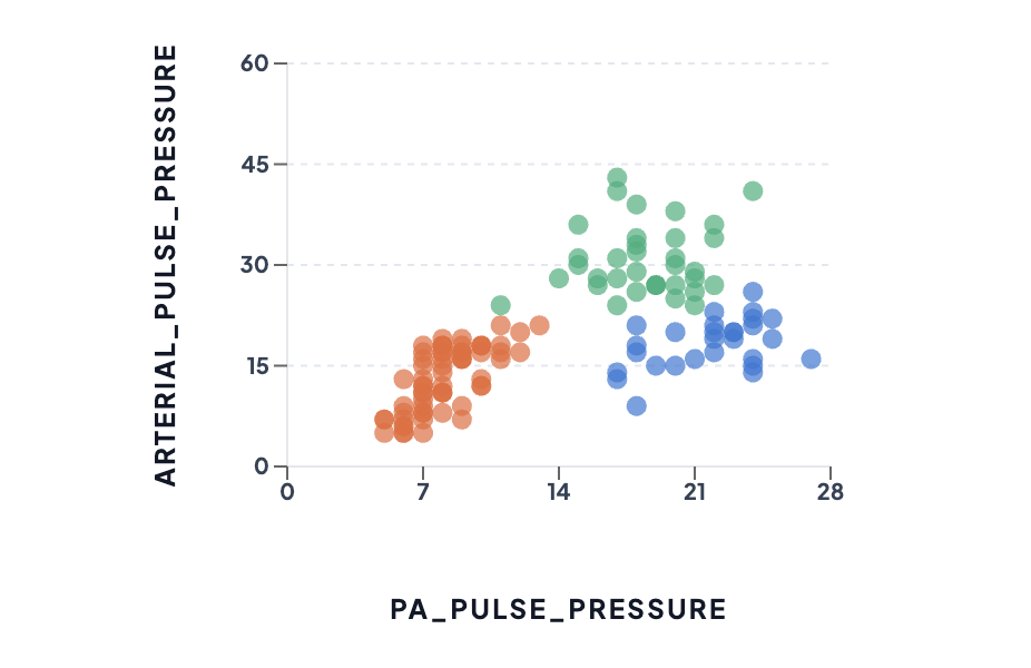
The three phenotypes on the first two clustering variables, both in mmHg. Orange is the low-pulsatility group, blue the LV-distension group, green the pulsatile group. Note that blue and green separate on the vertical axis while sharing the horizontal one — the third variable, filling pressure, is doing work you cannot see in two dimensions. The separation here is what a silhouette of 0.60 looks like: distinct, with a little contact at the boundaries.
Looking at the same groups three ways
A scatter plot of two variables is one view of a three-variable result, and it is worth seeing the others before believing any of them. The same clusters, drawn differently:
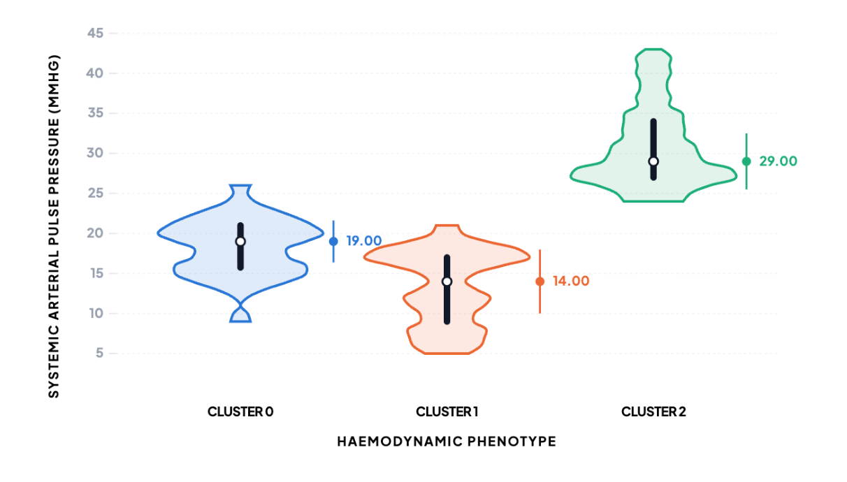
Systemic arterial pulse pressure by phenotype: median 19 mmHg for LV distension (blue), 14 for low pulsatility (orange), 29 for pulsatile (green). The violin adds what a table of means hides — the pulsatile group is not merely higher, it is wider, spanning roughly 24 to 43 mmHg, while low pulsatility is packed into a narrow band. A difference in spread is a finding in its own right, and "mean ± SD" does not show it.
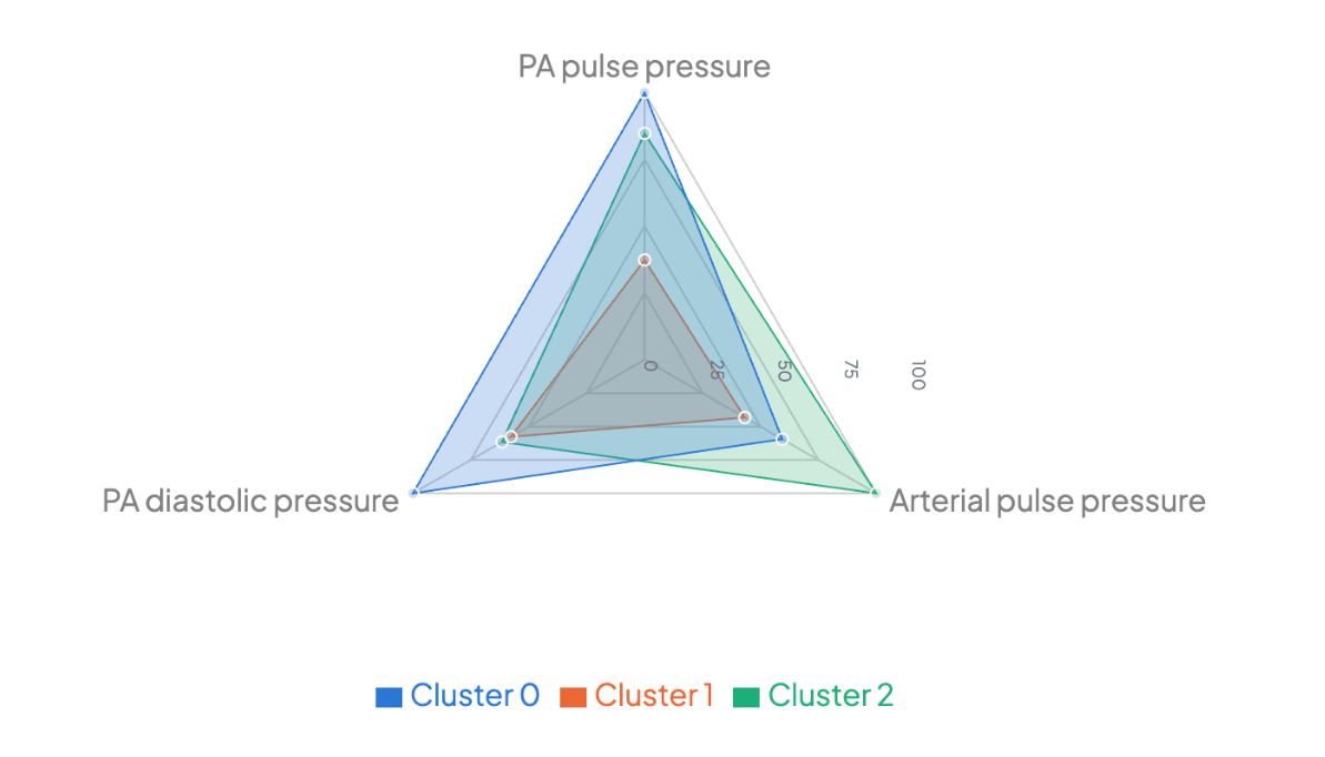
The same three groups as profiles rather than positions, with the colours matching the figures above. Each spoke runs from zero to the largest of the three group means, so how far out a group sits is proportional to its actual mean — half the radius is half the pressure. Read the radar for the shape of a profile, and the scatter or violin when you need the units themselves.
The radar earns its place because the phenotypes differ in pattern, not only in level. The LV-distension group (blue) reaches furthest on filling pressure while sitting mid-range on systemic pulsatility; the pulsatile group (green) does the reverse. Those two outlines cross, which is the clinical distinction, and it takes one figure here where the scatter needed two panels. Low pulsatility (orange) is the smallest triangle on all three spokes — the shape of a heart contributing very little, without being distended.
One caution about radars generally. If you scale each spoke from the smallest group to the largest instead of from zero — which maximises the visible gap, and is what many tools do by default — then the smallest group is pinned at zero by construction, and a group that is smallest on every spoke collapses onto the centre point and disappears while still occupying a legend entry. On this data that would have hidden the largest of the three phenotypes.
Do they matter?
A cluster is only interesting if it predicts something it was not given. Mortality was never shown to the algorithm:
- Pulsatile — Cluster 2 (n = 35): 31% died
- Low pulsatility — Cluster 1 (n = 65): 46% died
- LV distension — Cluster 0 (n = 28): 57% died
Overall, 57 of the 128 patients died. The groups separate on an outcome that played no part in forming them, and the ordering is clinically coherent: the patients whose hearts are still ejecting do best, and the distended ventricles do worst.
That is the test worth applying to any clustering result. Groups that differ only on the variables used to build them are a restatement of the input.
What this does not show
Three phenotypes emerged from these 128 patients, on these three variables, at this single centre. That is not the same as three phenotypes existing in cardiogenic shock. k-means finds groups in any dataset; the silhouette score says these are well separated, and the mortality difference says they are not arbitrary, but external validation in another cohort is what would make them a finding rather than a description.
Clustering is also unsupervised: nothing here says that a patient in the LV-distension group would benefit from venting, only that patients in that state died more often.
Running this yourself
The Clustering module takes a spreadsheet, standardises the variables, runs k-means or DBSCAN, computes silhouette scores across a range of k, and will save cluster membership back to your data as a new column — which is what lets you compare outcomes between clusters afterwards. Everything above was produced from the raw file, with no coding.
Run it on your own data → — Clustering is part of Pro. A free account gets you the data tools, Explore and group comparisons, so you can load your file and look at it before deciding.
You can also read up on the method first: the k-means clustering calculator explains what it does, when it is the right choice, and what to watch for.
Related reading
- Which statistical test should I use? — the decision guide this sits under.
- Which clustering algorithm? — k-means versus DBSCAN versus Gaussian mixture models, and when each is right.
- P-value vs effect size — why the mortality difference above needs an interval, not just a comparison.
The app's own Result Companion flags the caveat unprompted, before you have a chance to over-read the output: "Clustering always returns clusters, whether or not they are real — validate them (e.g. check the groups differ on a variable you did not cluster on)."
Based on. Lim HS, Vondrakova D, Micek M, Ostadal P. Phenotyping hemodynamic response to veno-arterial extracorporeal membrane oxygenation in cardiogenic shock. Physiological Reports 2026;14(11):e70961. doi:10.14814/phy2.70961 (open access, PMID 42231678). The analysis above takes its question, its three variables and its method from that paper, and works them through in Inference Stats on a separate extract of the cohort. It is not a reproduction of the published results, and the figures here should not be read as the paper's.
Written by Dr Hoong Sern Lim MB ChB MD FRCP, Consultant Cardiologist, Queen Elizabeth Hospital Birmingham; Honorary Senior Lecturer, University of Birmingham. ORCID 0000-0002-6569-1805